Copyright © 2011-2014 airxc.com, airxcell.com
Table of Contents
The Chart Wizard offers the user a way to chart values edited by the user on the Calculation Sheet (5). The Chart Wizard provides several panels aimed at helping the user to define the chart parameters.
The Chart Wizard uses underlying R commands to actually build the chart. Most panels are wrappers around an underlying R command and the input boxes shown on the panel usually correspond directly to a parameter of the R command. The various panels and the meanings of the parameters are defined below.
A new empty Chart Wizard can be added to the workspace by using
Workspace → New Module → New Chart
(![]() )
)
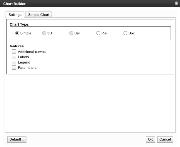
A newly created Chart Wizard looks as shown on Figure 7.1, “New Chart Wizard”.
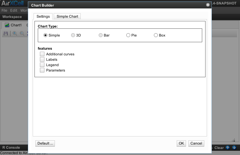
The user chooses the type of the chart as well as the set of additional parameters she wants to define on the chart. By choosing the type of the chart or when enabling an additional set of parameters, the corresponding new tab is added to the Dialog.
The user can choose amongst the following set of chart types:
- Simple : a simple chart with a curve given as a set of points or set of coordinates
- 3D : a 3D chart with a curve given as a set of points or set of 3D coordinates (unsupported as of version 0.5.10-SNAPSHOT of AirXCell.)
- Bar : a Bar Graph given as a set of values interpreted as height of each bars (unsupported as of version 0.5.10-SNAPSHOT of AirXCell.)
- Pie : a Pie Chart given as a set of values interpreted as the quantities of each part.
- Box : a standard statistical box chart given as a set of values for a probabilistic variable.
In addition to the type of the chart, the user can enable / disable the following sets of additional features:
- Additional curves : used to draw additional curves on the chart by selecting additional source values.
- Labels : used to set the various possible labels on the chart.
- Legend : used to add a legend on the chart.
- Parameters : used to specify various general parameters of the chart such as font size, borders, etc.
The Simple Chart panel offers the user the most basic chartting feature. A set of values are drawn as a
curve on an X-Y chart. The Simple Chart panel is built around the underlying chart(...) R command.
The Simple Chart panel looks as shown on Figure 7.2, “Simple Chart Panel”.
The Chart Curve defines the curve to be chartted on the chart. The values of the curve can be typed in or selected on the workspace Calculation Sheet instances. In addition, the user can control various parameters of the curve such as the line type, the color, etc.
Whenever the user selects one single series of data as the X-Value, that value is actually used as an Y-value while the X value becomes the index / position of each value in the set.
The user can choose the labels displayed on the chart. The various labels are
- Main Label : an overall title for the chart.
- Sub-Label : a sub title for the chart.
- X Label : a title for the x axis.
- Y Label : a title for the y axis.
The user can control the x/y aspect ratio of the chart. If it is a finite positive value then the window is set up so that one data unit in the X direction is equal in length to the 1 data unit x value in the Y direction. The special case with value 1 produces charts where distances between points are represented accurately on screen.
The Pie Chart panel offers the user the possibility to build a pie chart.
The Pie Chart panel is built around the underlying pie(...) R command.
The Pie Chart panel looks as shown on Figure 7.3, “Pie Chart Panel”.
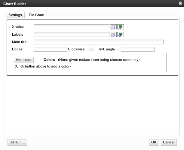
The available parameters or values are as follows:
- X value : a vector of non-negative numerical quantities. The values in x are displayed as the areas of pie slices.
- Labels : one or more expressions or character strings giving names for the slices.
- Main title : an overall title for the chart.
- Edges : the circular outline of the pie is approximated by a polygon with this many edges.
- Clockwise : logical indicating if slices are drawn clockwise or counter clockwise (i.e., mathematically positive direction).
- Init. Angle : number specifying the starting angle (in degrees) for the slices. Defaults to 0 (i.e., "3 o'clock") unless clockwise is true where the starting angle defaults to 90 (degrees), (i.e., "12 o'clock").
In addition. various colors can be added which are then used as the set of colors to be applied to the various quantities.
The Box Chart panel offers the user the possibility to build box charts
for the different sets of data given as X values.
The Box Chart panel is built around the underlying boxchart(...) R command.
The Box Chart panel looks as shown on Figure 7.4, “Box Chart Panel”.
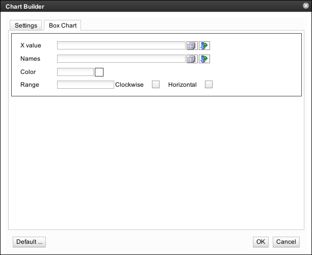
The available parameters or values are as follows:
- X value : data from which the boxcharts are to be produced. Either a numeric vector, or a single list containing such vectors. Additional unnamed arguments specify further data as separate vectors (each corresponding to a component boxchart).
- Labels : group labels which will be printed under each boxchart.
- Color : assumed to contain colors to be used to colour the bodies of the box charts. By default they are in the background colour.
- Range : this determines how far the chart whiskers extend out from the box. If range is positive, the whiskers extend to the most extreme data point which is no more than range times the interquartile range from the box. A value of zero causes the whiskers to extend to the data extremes.
- Horizontal : indicates if the boxcharts should be horizontal.
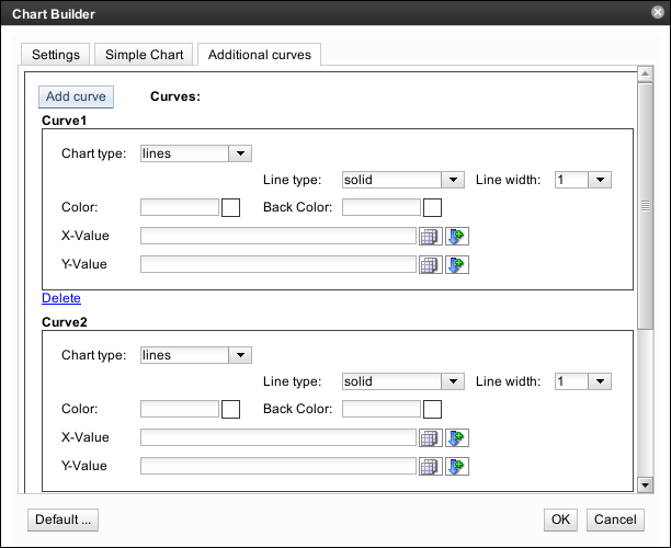
The Additional Curves panel is used by the user to add additional curves or set of data on
the chart defined on the previous panels. The settings are exactly the sames than those presented in
Simple chart panel (7.3) regaring the chart
curve. The Additional Curves panel is built around the underlying
lines(...) R command.
The Additional Curves panel looks as shown on Figure 7.5, “Additional Curves Panel”.
It is possible to specify the labels to be put on the chart (main, sub, etc.) on some of the chart building panels.
However, when this is the case, only the labels themselves can be set, it is not possible to tune the look of the
labels such as the font size or the color. The Labels panel is built around the underlying
title(...) R command.
This panel offers the user with a way to define these labels along with the presentation settings such as font family, font size, colors, etc. Labels set through panel have precedence on those set on the individual chart building panels.
The Labels panel looks as shown on Figure 7.6, “Labels Panel”.
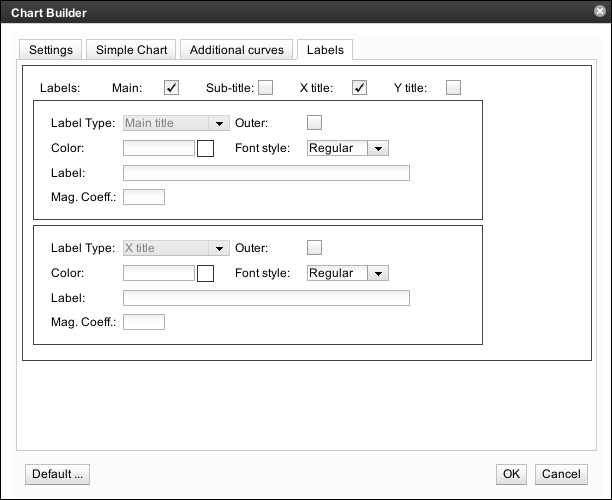
The available parameters worth a few additional words are as follows:
- Outer : when checked, the titles are placed in the outer margins of the chart.
- Mag. Coeff : the magnifying coefficient, useful for making the label look bigger or shorter.
The Chart Legend panel provides the user with a way to add a legend on the panel. The
content of the legend as well as its style, location, etc. can be specified. The Chart
Legend panel is built around the underlying legend(...) R command.
The Chart Legend panel looks as shown on Figure 7.7, “Chart Legend Panel”.
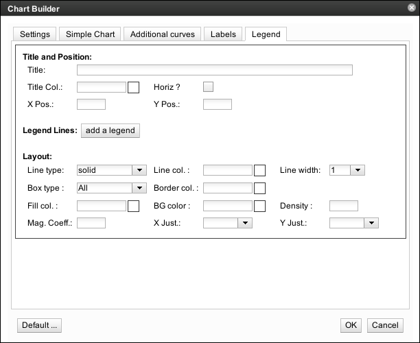
The user can choose the general Legend parameters.
- Title : the title of the legend
- Title Col. : the color of the font.
- Horiz : whether or not the legend should be drawn horizontaly or verticaly.
- X Pos : the X position of the legend. This is a bit special and might be tricky since the X is expessed as a value on the X axis.
- Y Pos : the Y position of the legend. This is a bit special and might be tricky since the Y is expessed as a value on the Y axis.
Each line from the legend is edited from here. The user can add new lines as required or remove existing lines.
The Chart Parameters panel provides the user with a way to change the settings related
to the general chart parameters such as the border, the background color, etc.
The Chart Parameters panel is built around the underlying par(...) R command.
The Chart Parameters panel looks as shown on Figure 7.8, “Chart Parameters Panel”.
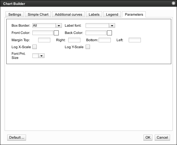
The available parameters worth a few additional words are as follows:
- Box Border : choose amongst various possible combinations of borders such as all, top-left, all-but-top, etc.
- Label font : the font to be used for the labels.
- Front Color : the color to be ased for drawings.
- Back Color : the background color.
- Margin : the margins to use on every sie.
- Log X-Scale : should the X-scale be logarithmic ?
- Log Y-Scale : should the Y-scale be logarithmic ?
- Font Pnt. Size : the font size to be used for labels.
Once the chart is displayed, the user can change its settings using the
![]() settings button.
settings button.
Besides, the following actions are available from the toolbar:
 Save Image :
save the image as a file.
Save Image :
save the image as a file.
 Zoom In :
zoom in (image gets bigger).
Zoom In :
zoom in (image gets bigger).
(Ctrl + '+') Zoom Out :
zoom out (image gets smaller).
Zoom Out :
zoom out (image gets smaller).
(Ctrl + '-') Adjust Size :
adjust the display size of the image to the available viewport.
Adjust Size :
adjust the display size of the image to the available viewport.
 Original Size :
display image in original size (server side generated size).
Original Size :
display image in original size (server side generated size).
 Settings :
show chart settings.
Settings :
show chart settings.